Color, in fashion, has always functioned as more than surface decoration. It is a non-verbal system of communication, encoding mood, cultural direction, and psychological intent into wearable form. In early 2026, this system is undergoing a subtle but meaningful transformation. Rather than bold seasonal declarations or rigid trend cycles, we are witnessing the emergence of what can be described as an emotional palette—a spectrum of colors defined not by visibility alone, but by how they make the wearer feel and how they respond to contemporary life.
From the depth of midnight cobalt to the softness of sage mist, the dominant tones of early 2026 reflect a broader shift toward introspective, adaptable, and emotionally intelligent dressing. This article evaluates these colors not as isolated trends, but as functional tools within modern wardrobes, analyzing their performance across styling, versatility, and long-term relevance.
The Concept of an Emotional Palette
Beyond Traditional Color Trends
Historically, fashion color trends have been dictated by:
- Seasonal forecasts
- Runway dominance
- Market replication
In 2026, this model is evolving. Color is no longer prescribed in rigid hierarchies but emerges as a fluid system influenced by lifestyle, environment, and psychological needs.
Emotional Function in Dressing
Colors now serve to:
- Regulate mood
- Enhance comfort
- Communicate subtle identity
This shift aligns with broader cultural movements toward mindfulness and intentional living.
Evaluation
The emotional palette represents a qualitative upgrade in how color is understood—moving from visual impact to experiential value.
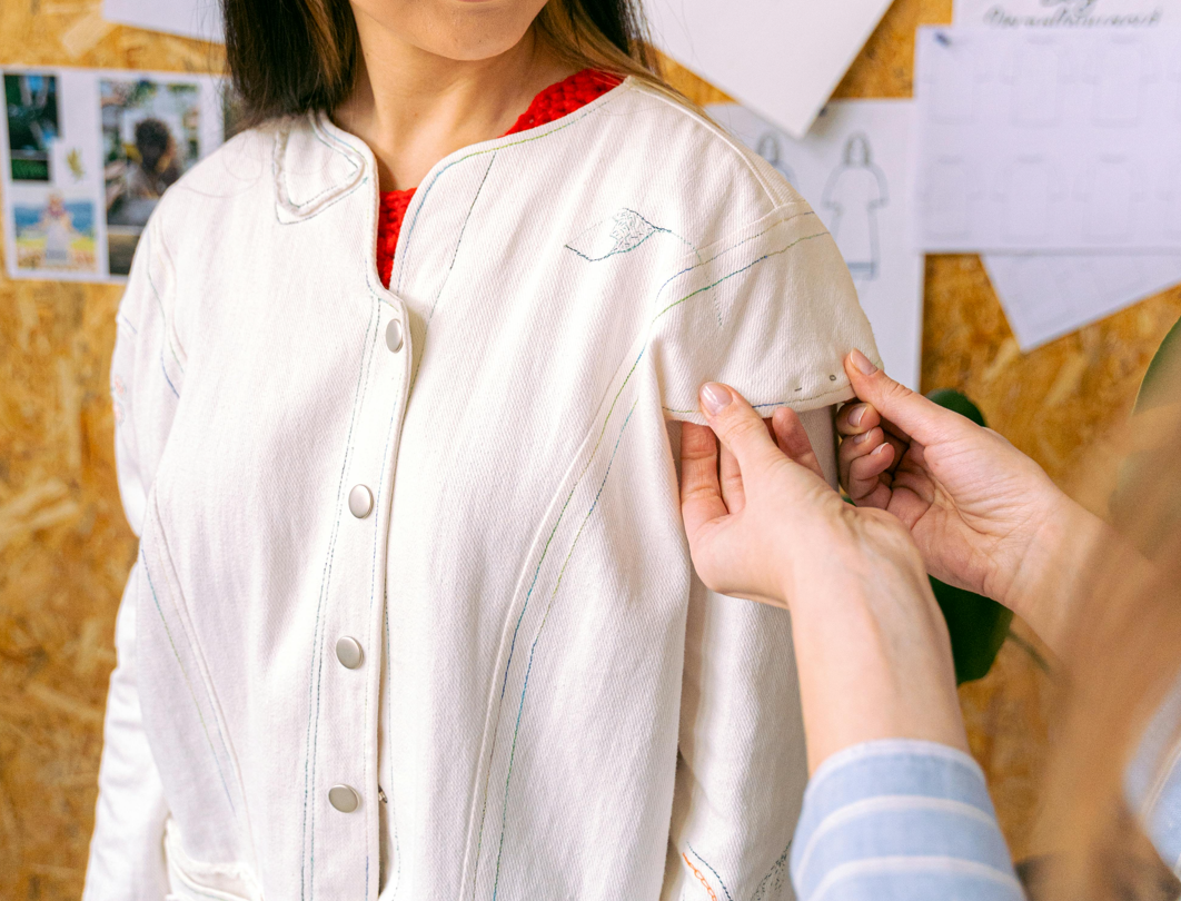
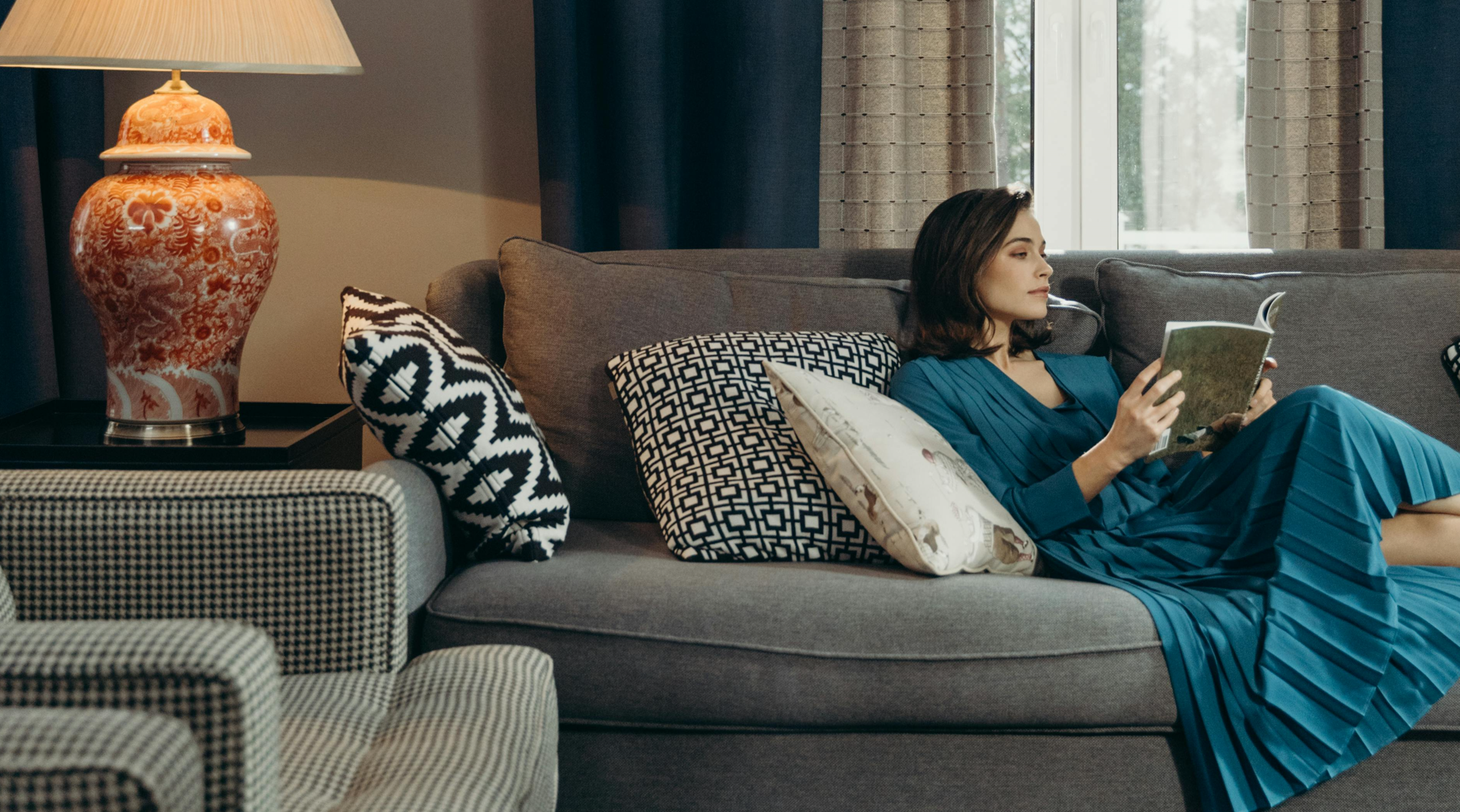
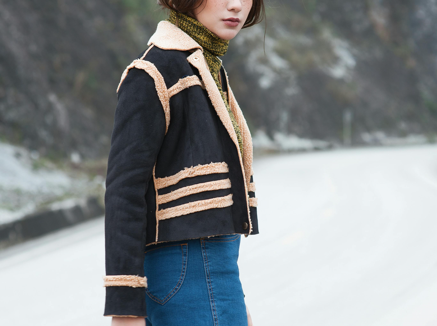
Core Color #1: Midnight Cobalt
Characteristics
Midnight cobalt is a deep, saturated blue that sits between navy and true cobalt. It offers:
- Visual depth
- Strong presence without harshness
- Compatibility with both warm and cool tones
Performance in Wardrobes
- Versatility: High
- Formality Range: Broad
- Seasonal Adaptability: Excellent
It functions effectively as a replacement for black, offering more dimension while maintaining sophistication.
Styling Applications
- Tailoring pieces (blazers, trousers)
- Outerwear with clean silhouettes
- Monochromatic layering
Evaluation
Midnight cobalt is one of the most structurally reliable colors of 2026—capable of anchoring entire outfits while avoiding visual fatigue.
Core Color #2: Sage Mist
Characteristics
Sage mist is a muted green with grey undertones, defined by:
- Softness
- Subtle warmth
- Low saturation
Performance in Wardrobes
- Versatility: High
- Formality Range: Moderate
- Seasonal Adaptability: Strong
It excels in transitional dressing, particularly in spring environments.
Styling Applications
- Lightweight outerwear
- Knitwear and layering pieces
- Casual tailoring
Evaluation
Sage mist offers a calming visual presence, making it ideal for wardrobes that prioritize ease and understated elegance.
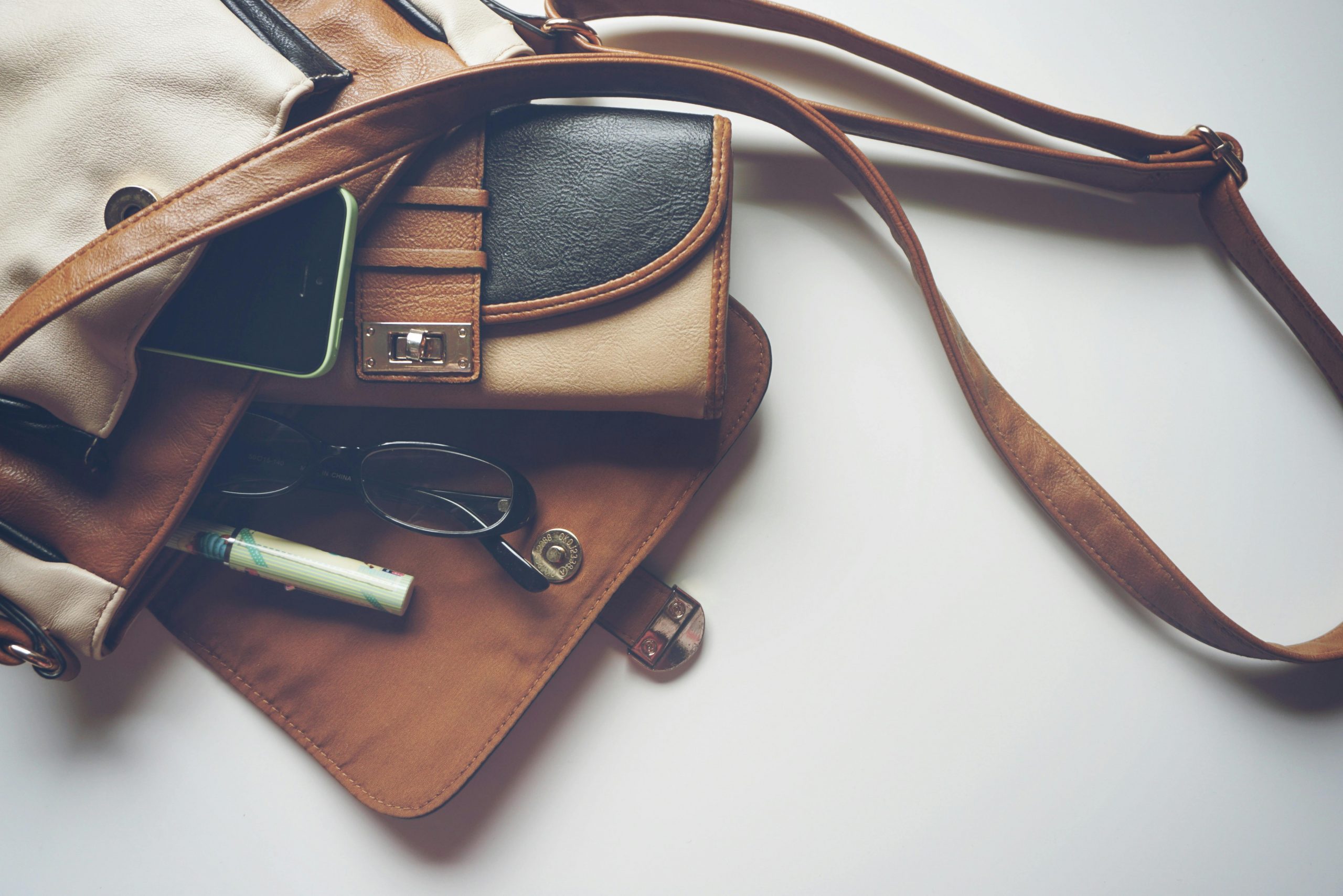
Core Color #3: Warm Clay
Characteristics
Warm clay introduces earthy depth:
- Reddish-brown undertones
- Organic, grounded feel
- Strong compatibility with neutrals
Performance in Wardrobes
- Versatility: Moderate to high
- Formality Range: Moderate
- Seasonal Adaptability: Good
Styling Applications
- Accessories (bags, shoes)
- Mid layers (sweaters, overshirts)
- Accent pieces
Evaluation
Warm clay adds emotional warmth and prevents palettes from becoming overly cool or sterile.
Core Color #4: Soft Charcoal
Characteristics
Soft charcoal refines traditional grey:
- Slight warmth
- Reduced harshness
- Greater depth
Performance in Wardrobes
- Versatility: Excellent
- Formality Range: Very high
- Seasonal Adaptability: Universal
Styling Applications
- Tailoring
- Outerwear
- Base layering
Evaluation
Soft charcoal remains a foundational neutral, elevated through subtle tonal adjustments.
Core Color #5: Pale Stone
Characteristics
Pale stone is a light neutral positioned between beige and grey:
- Clean and understated
- Reflective without brightness
- Highly adaptable
Performance in Wardrobes
- Versatility: Excellent
- Formality Range: Broad
- Seasonal Adaptability: Strong
Styling Applications
- Spring outerwear
- Trousers
- Base layers
Evaluation
Pale stone functions as a balancing agent, softening darker tones and enhancing overall cohesion.
Color Interaction: Building Cohesive Palettes
Tonal Layering
Combining variations of a single color family creates:
- Visual continuity
- Depth without contrast overload
- Elevated minimalism
Controlled Contrast
Pairing complementary tones—such as midnight cobalt with sage mist—introduces:
- Subtle visual interest
- Emotional balance
Neutral Anchoring
Neutrals like soft charcoal and pale stone stabilize more expressive colors.
Evaluation
The effectiveness of the emotional palette lies in interaction, not isolation.
Psychological Impact: Why These Colors Matter
Stability and Calm
Muted tones reflect a desire for:
- Emotional stability
- Visual comfort
- Reduced overstimulation
Subtle Expression
Rather than bold statements, these colors allow for:
- Nuanced identity
- Personal interpretation
Adaptability
The palette supports:
- Multiple contexts
- Changing environments
- Layered styling
Evaluation
Color in 2026 functions as a tool for emotional regulation, not just aesthetic expression.
Application Across Wardrobe Categories
Tailoring
- Midnight cobalt and soft charcoal dominate
- Clean lines enhance color depth
Knitwear
- Sage mist and warm clay add softness
- Texture enhances color perception
Outerwear
- Pale stone and muted tones create versatility
- Layering potential increases
Accessories
- Warm clay and deeper tones provide contrast
- Smaller items allow for experimentation
Common Mistakes in Using the 2026 Palette
Over-Muting
Excessive use of low-saturation colors can lead to:
- Visual flatness
- Lack of distinction
Poor Contrast Management
Failing to balance tones results in:
- Washed-out outfits
- Reduced visual impact
Ignoring Texture
Without texture variation, even strong color palettes lose depth.
Investment Perspective: Color as a Long-Term Strategy
Why Color Matters Financially
- Increases versatility of garments
- Extends relevance across seasons
- Enhances wardrobe cohesion
Smart Purchasing Approach
- Invest in core pieces in foundational tones
- Introduce color through mid layers and accessories
- Avoid overly trend-specific shades
Comparative Analysis: 2026 vs Previous Years
2023–2024
- Dominance of bold statements
- High contrast palettes
2025
- Rise of quiet luxury
- Neutral-heavy wardrobes
2026
- Balanced emotional palette
- Integration of subtle color variation
Evaluation
2026 represents a mature synthesis of previous trends.
Final Verdict: The Power of Emotional Color
The early 2026 palette is not defined by novelty, but by intentional refinement.
- Midnight cobalt provides depth
- Sage mist introduces calm
- Warm clay adds warmth
- Soft charcoal anchors
- Pale stone balances
Together, they form a system that is:
- Versatile
- Emotionally resonant
- Structurally sound

Conclusion: Dressing Through Emotion
Fashion in 2026 is no longer driven solely by visual impact. It is shaped by:
- Experience
- Adaptability
- Emotional intelligence
The shift toward an emotional palette reflects a broader evolution in how we engage with clothing. Garments are no longer just seen—they are felt, interpreted, and lived in.
In this context, color becomes one of the most powerful tools available. Not because it demands attention, but because it supports the wearer in navigating an increasingly complex world with clarity and subtlety.
And in that sense, the palette of early 2026 is not just a trend—it is a framework for modern dressing, where emotion and design operate in quiet, deliberate harmony.